- Differentiate between levels of measurement
- Differentiate between classification methods
- Retrieving data from the U.S. Census and joining data
- Enhance cartographic knowledge
Nominal Data:
Nominal data is data represented through classifications into categories. There are no quantitative measurements discretely measured in this type of data. There must be at least two different categories being used. This type of data uses words as representations of classifications of data. No real comparisons are made between the different classification categories. Each category is taken for what it is and correlations are not made between the different categories.
Example 1: Nominal data can depict preferences of regions, states, counties, or others. An example is a map depicting the favorite baseball team of each U.S. County is an example of nominal data. This can be considered nominal data because it groups a county into a category depending on which baseball team is liked more. There are no quantitative measurements or relationships used between the different baseball teams. In Figure 1 is a map depicting what the favorite baseball team of each county in the U.S. (Meyer).

Figure 1. An example of nominal data by determining which baseball team is the most popular in the different counties of the U.S. (Meyer).
Example 2: Nominal data can also represent medical results by displaying which diseases are the highest or lowest in regions, states, or others. An example is a map giving the most common cause of death in each state in the U.S. This is an example of nominal data because different diseases are assigned to different states with no numerical data. Different diseases represent different categories and states are assigned to these categories. In Figure 2 is a map highlighting what the most common cause of death in each state other than heart disease or cancer (Blatt).

Figure 2. An example of nominal data is categorizing states by which diseases are the highest causes of death other than cancer and heart disease (Blatt).
Ordinal Data:
Ordinal data is data that has a clear scale establishing which values are of greater or lesser worth than other values. Ordinal data uses scales of rank to structure data in a system of rank. An example of ordinal data is at the doctor's office when the doctor has the patient rank their pain on a scale of 1 to 10.
Example 1: Examples of ordinal data can include data that ranks places as the best or worst at things based on a scale. An example of this kind of ordinal data would be data on the best and worst places to live in the US. Figure 3 is an example of ordinal data. All 50 states of the U.S. are ranked on being the worse and safest states to live in based on crime data (Peter). It was determined that the safest place to live is South Dakota and the most dangerous place to live is District of Columbia.

Figure 3. A map ranking the worse and safest states to live in the U.S. (Peter). This is considered ordinal data because the states are ranked against each other.
Example 2: A second example of ordinal data is economic ranking data. In Figure 4, the 50 states of the U.S. are ranked based on economic outlook rankings (Horvath). New York has the worst economic outlook and Utah has the best economic outlook according to this data. This data is considered ordinal because the data from each state is ranked according to the data from other states.

Figure 4. The ranking of the richest and poorest states in the U.S. (Horvath). This data is ordinal because the data from each state is compared to that of other states and then ranked against each other to present the data.
Interval Data:
Interval data is a continuous numeric data set with no established zero point. This type of data allows people to determine which data is greater or less than others, but without the exact zero point ratios cannot be established.
Examples: A good examples of interval data is standardized test scores. IQ and ACT test scores do not have an absolute zero score. The score achieved is just compared to other scores achieved by others to determine the quality of the score. Figure 5 gives the break of IQ test scores globally (National IQ Scores) and Figure 6 gives the distribution of ACT scores by state in the U.S. (Liu).

Figure 5. The average national IQ scores for the globe (National IQ Scores). This map is an example of interval data because there is no absolute zero IQ score.
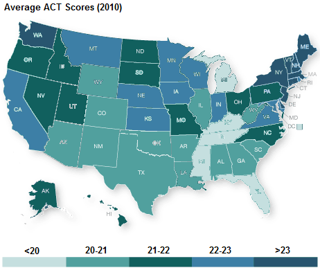
Figure 6. The average ACT scores for each state in the U.S. (Liu). Again there is no absolute zero ACT test score meaning this data is interval.
Ratio data is a continuous numeric data set with a naturally established zero point. This data type allows for good comparisons and ratios can be established. Magnitude of the data set can be determined. Because of the exact zero point a wider range of statistics can be applied to this data.
Example 1: An example of ratio data is a data set showing the percent of adults twenty years and older who are obese (American Obesity Treatment Association). In Figure 7, the data shows that the greatest amount of obesity in the U.S. can be found in southeastern U.S. This data set is ratio data because rates were calculated which can be done with ratio data because there is an absolute zero meaning there is magnitude to the data.

Figure 7. The percent of adults 20 years old and older that are obese in the United States (American Obesity Treatment Association). The absolute zero value that exists within the data set makes this an example of ratio data.
Example 2: A second example of ratio data is energy industry spatial distributions. Figure 8 maps the active manufacturing facilities in 2015 and the amount of megawatt energy created by each state (Wanner). The state that creates the most megawatt energy from wind is Texas. This is an example of ratio data because there is absolute zero value, a state could make zero megawatts of energy from wind-related manufacturing.

Figure 8. The wind-related manufacturing facilitates in the U.S. and which states produce the least and greatest amounts of mega wattage this way (Wanner). The absolute zero value that exists makes this data an example of ratio data.
Part 2: Working with USDA and U.S. Census data
This part of the assignment is a mock assignment from an agriculture consulting/ marketing company, looking to determine where the new USDA Certified Organic Farms should be placed in Wisconsin. To determine where current USDA Certified Organic Farms are located 2012 census of agriculture data was used for each Wisconsin county.
To begin the project, I first used agriculture data from the 2012 Census of agriculture. In an excel file the GEO-ID for each Wisconsin County and the name of the county was recorded. An OrganicAg column was added where the number of organic farms in the county was recorded. Next, from the United States Census Bureau website the shape file for Wisconsin counties was downloaded. The file was unzipped and added to an ArcMap viewer. The excel file was also added to the ArcMap viewer as a sheet. The sheet was joined to the shape file by joining based on the GEO_ID field. The shapefile was then prepared to start displaying data.
The organic farm data was displayed in three different classification methods: natural breaks, equal interval, and quantile. All three of these methods can be seen in Figure 9.
The natural breaks method works by placing breaks between classes where breaks look like they should be placed based on spacing in the data values. Where there are noticeable spaces in between data values breaks between classes are placed.
The equal interval method works to make each classification equal. This method divides the range by the number of classes to be created. This method may result in some classes not having any values from the data because it does not consider the middle values in the data set. This method only considers the smallest and largest value of the data set.
The quantile method works by making sure that each class has an equal number of data values. The problem with this method is that it may misrepresent the natural organization of the data by forcing data values into organized classes just based on the number of values per class alone.

Figure 9. Displaying concentrations of USDA certified organic farms by county in Wisconsin. Three different classification method were used to give different symbolization of the same organic farms data set.
By using the Figure 9 data, I think that new USDA certified organic farms should be placed in the northeast counties of the Wisconsin counties. Specifically I think Vilas and Oneida counties could benefit from more organic farms because in all three classification methods those counties have the smallest number of organic farms and are the farthest away from existing organic farm locations. I think the map that most accurately represents where current organic farms are located is the natural breaks map, because this map looks specifically at the organization of the data to determine where breaks should be placed. This method does not force a certain number of values into each class like the quantile method or only look at the range of values ignoring the importance of the middle values of the data set like the equal interval method. The equal interval map has categories with no values represented and some categories with only now county in it. It does not give a good overall representation of the data set. I Figure 9 it can be seen that the classes of the quantile map cover very different spreads of data, one class only includes three values and another includes 112. Because of this it makes some counties appear like they have significantly more organic farms than other counties when they do not. This scale does not group counties with similar numbers of organic farms together, but rather is focused on getting the same number of values in each category. I would recommend using the natural breaks map to determine where to place new organic farms. This method looks to group counties with similar numbers of organic farms together, based on breaks in the data that naturally occur. This map shows a limited number of organic farms in northern Wisconsin and central Wisconsin. I would not advise placing organic farms in central Wisconsin because that is where large cities and residential areas like Madison are located, so there most likely is not space for large farming operations there. I would advise placing the organic farms in the north where there are few and more land available for farming due to the lack of large cities there. The natural breaks map most accurately represents the distribution of organic farms in Wisconsin counties.
Citations:
American Obesity Treatment Association. (n.d.). U.S. Obesity Trends. Retrieved September 24, 2017, from http://www.americanobesity.org/obesityInAmerica.htm.
Blatt, B. (2014, June 03). You Live in Alabama. Here's How You're Going to Die. Retrieved September 21, 2017, from http://www.slate.com/articles/life/culturebox/2014/06/death_map_the_most_common_causes_of_death_in_each_state_of_the_union.html.
Data Access and Dissemination Systems (DADS). (2010, October 05). American FactFinder. Retrieved September 24, 2017, from http://factfinder2.census.gove/faces/nav/jsf/pages/index.xhtml.
Horvath, J. (2016, April 14). Rich States, Poor States: 9th Edition Released. Retrieved September 24, 2017, from https://www.alec.org/article/rich-states-poor-states-9th-edition-released/.
Liu, Q. (1970, January 01). Professor Q's taught Queue. Retrieved September 24, 2017, from http://qiyuliu.blogspot.com/2012/06/.
Meyer, R. (2014, March 31). Here Is Every U.S. County's Favorite Baseball Team (According to Facebook). Retrieved September 21, 2017, from https://www.theatlantic.com/technology/archive/2014/03/here-is-every-us-countys-favorite-baseball-team-according-to-facebook/359917/.
NASS- National Agricultural Statistics Service. (n.d). Retrieved September 24, 2017, from https://www.agcensus.usda.gov/Publications/2012/Full_Report/Census_by_State/Wisconsin/index.asp.
National IQ Scores. (n.d.). Retrieved September 24, 2017, from https://www.targetmap.com/viewer.aspx?reportId=2812.
Peter, John. (2016, September 20). Where are safest and cheapest place to live from USA? Retrieved September 24, 2017, from https://www.quora.com/Where-are-safest-and-cheapest-place-to-live-from-usa.
Wanner, C. (2017, February 27). What's the state of American wind power manufacturing? Retrieved September 24, 2017, from http://www.aweablog.org/whats-state-american-wind-power-manufacturing/.